Here’s the list of our favourite and not so favourite examples of modern cartography, in no particular order…
Map Fails
1. Fox News (US)
Fox News in the US lives by the motto “We Report; You Decide”. Well, we have decided your attempt at Middle Eastern geography is a FAIL!

2. Mapping Disasters
The media always seem to trip over themselves in their hurry to post stories about large scale disasters. Below are some excellent examples of media outlets falling flat on their cartographic faces.
As if Queensland hasn’t been through enough – their sovereignty of Far North Queensland gets challenged…

…and then they’re mistaken for Tasmania!

3. Google Dutch Treat
Never one to shy away from border disputes – Google’s interpretation of the Northern Dutch/German border would no doubt leave the Emden dockworkers fearing an invasion of oliebollen and kroketten from the south, or worse still – Heineken.
 (courtesy of Strange Maps)
Not to be outdone by Google, Microsoft has joined the Map Fail party by somehow miniaturising the Atlantic Ocean for the benefit of a few Florida condominium owners.

4. A Geospatial Metaphor for the NSW Labor Party?
The Sydney Morning Herald get full marks for trying to raise the interactive mapping bar in their NSW Election coverage. Unfortunately, they get zero for their ability to present contiguous boundary data.

5. Worst. Map. Ever?
Whether we call ourselves neo-geographers, geo-geeks or just plain old geospatial professionals – we should always acknowledge the pioneering work done over the centuries by cartographers who had to produce maps using only paper and ink. But not today…
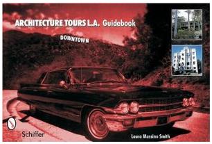
From Architecture Tours L.A. Guidebook (Downtown Edition) we present quite possibly the worst map in cartographic history:
 (courtesy of Eric Richardson/Flickr)
Map Wins
1. The social Network

View high-res (3.8MB) (link currently down)
The great thing about the Facebook friends map is not just how well it shows friends connecting around the World: it’s also great because it wasn’t put together by some geo-veteran or even using geospatial software. It was put together by a Facebook intern who though it was a neat idea; and done using R – best known for statistical modelling, not mapping.
Here’s his Facebook page explaining how and why he did it.
2. Got a Spare $25,000,000?

Haven’t got $25 million handy? Then use the slidebar below the map to see some geo-greatness and the “more affordable” housing.
Press the play button if you’d like of tour of New York’s finer accommodation.
3. Blatant Eye Candy

Ok, so this map doesn’t do much except look good – but it’s still one of the best examples of geo-temporal analysis (i.e. looking at geographic trends over time) online.
BTW – beyond the eye candy, the map shows annual property sales from 1875 onwards.
4. A Map You’ll Swear by

Heat maps when used correctly are an excellent tool for visualising important geospatial trends. They are also useful for flippant, yet strangely interesting trends, such as a map showing where Twitter users swear the most in their tweets.
In case you were wondering where they swear the most? It’s not Salt lake City, Utah oddly enough. The blog tells you where.
5. Geospatial Analysis – Cause and Effect

This recent, excellent piece of analysis by the NSW Bureau of Crime Statistics and Research (BOCSAR) has highlighted once and for all the geospatial relationship between assaults and their proximity to pubs and clubs.
At a time when the media and industry bodies treat fact and opinion as interchangeable things, it’s refreshing to see some cold, hard geo-research cutting through the spin and the agendas.
Your Faves
That’s the GeoRabble’s faves, how about yours? Let us know in your comments…

One thought on “Map Wins and Map Fails”